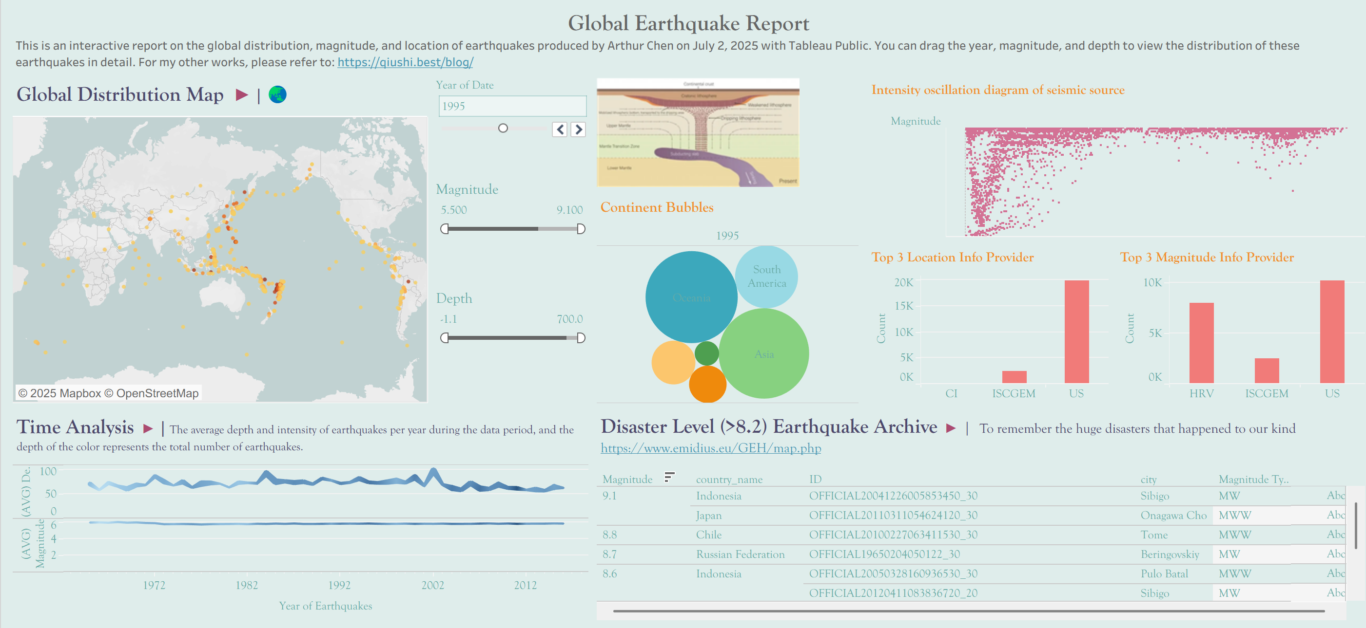
Tableau Interactive Earthquake Map
Check the final result through: https://public.tableau.com/app/profile/qiushi.chen4012/viz/Book1_17514348462240/Dashboard?publish=yes
In this section, I will show you how to create an earthquake distribution archive with map coordinates, taking into account Gantt chart, bubble chart, and band chart. Firstly, I obtained the codes, intensities, and latitude and longitude coordinates of various earthquakes over the past fifty years. But this is still far from our analysis, as latitude and longitude need further conversion to be divided into countries and continents.
I have used these two libraries :
- Reverse Geocoder
- Pycountry
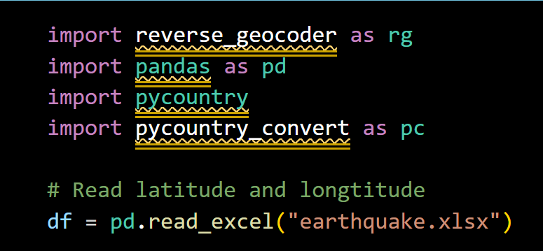
Through code below, we can get columns with detailed information of each earthquake:
# convert country code to country name
def code_to_name(cc):
    try:
        return pycountry.countries.get(alpha_2=cc).name
    except:
        return 'Unknown'

# code to continent
def code_to_continent(cc):
    try:
        country = pycountry.countries.get(alpha_2=cc)
        continent_code = pc.country_alpha2_to_continent_code(country.alpha_2)
        return pc.convert_continent_code_to_continent_name(continent_code)
    except:
        return 'Unknown'

#
coords = list(zip(df['Latitude'], df['Longitude']))

# user reverse geocoding to get geographic info
results = rg.search(coords)

# extract information from reverse_geocoder
df['country_code'] = [get_safe(r, 'cc') for r in results]
df['city'] = [get_safe(r, 'name') for r in results]  # nearest location name
df['region'] = [get_safe(r, 'admin1') for r in results]  # sovernty

# user pycountry to get standardized name
df['country_name'] = df['country_code'].apply(code_to_name)
df['continent'] = df['country_code'].apply(code_to_continent)
Next, we will design a map and connect the seismic source and intensity together through different marks. If you like, you can also build your own unique map through the components in CARTO.
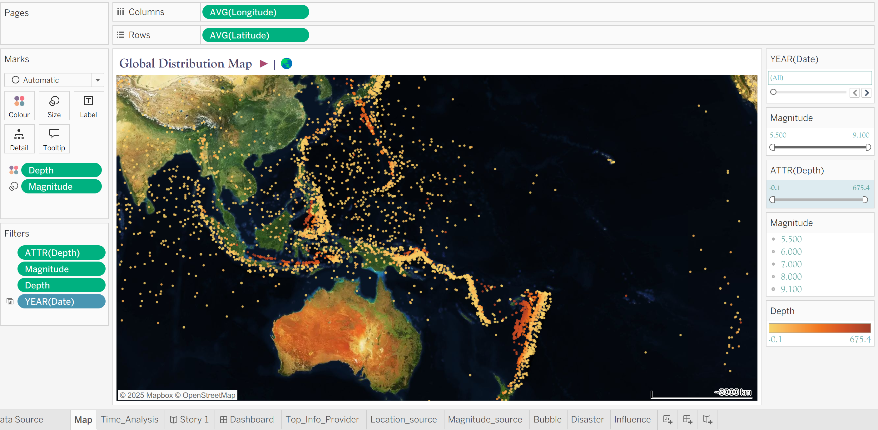
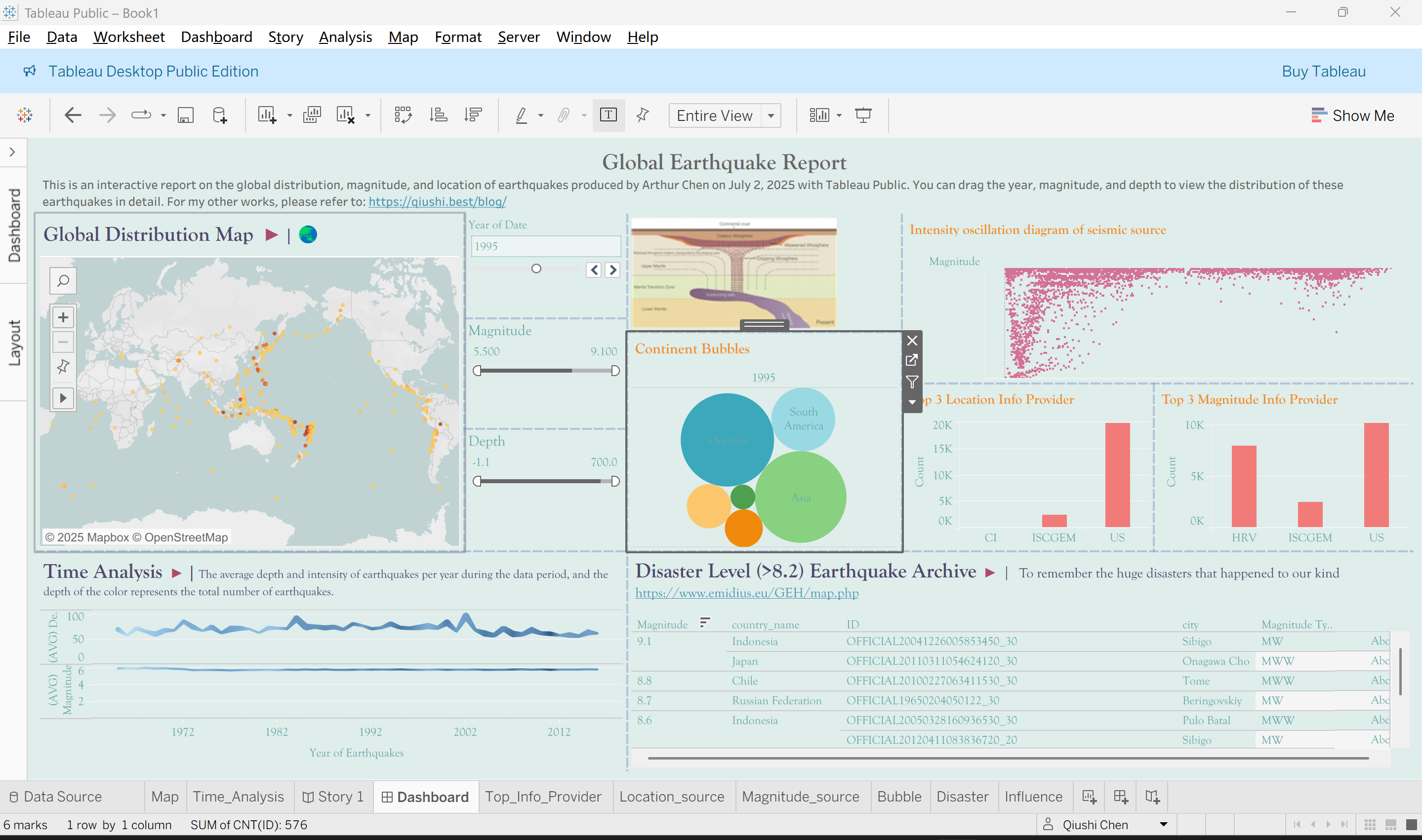
We create parameters and calculation fields to visually filter out the top list and earthquakes in certain intensity ranges that we need, and pull these fields into the canvas’s filtering or page position to interact with the data graph.
All of our filters can be organized and organized in the final dashboard. Insert the literature and links we need in the appropriate place.
Hope you like it.